IYU Labs / Design / 04
The pieces we actually use.
These specimens import the same components as the website. Try the states, use the keyboard, and copy a small example when you need it.
Actions
Use a button for an action and a link for a destination. Give the primary action the strongest visual weight. Tab reaches each enabled control; Enter activates either kind.
Example activated 0 times.
import { Button, ButtonLink } from "@/components/ui/Button"
import { TextLink } from "@/components/ui/TextLink"
import { ExternalLink } from "@/components/ui/ExternalLink"

<Button onClick={handleAction}>Try an action</Button>
<ButtonLink href="/work">View work</ButtonLink>

// TextLink uses internal navigation. ExternalLink announces its new tab.
<TextLink href="/about" withArrow>About the studio</TextLink>
<ExternalLink href="https://github.com/iurman/iyulabs">Repository</ExternalLink>
Preview settings stay inside this specimen.
Disclosures
Put supporting information behind a clear question. Keep essential content in view. Rapid toggles reverse the current transition.
import { TextLink } from '@/components/ui/TextLink'
import { ExternalLink } from '@/components/ui/ExternalLink'
import { Disclosure } from "@/components/ui/Disclosure"

<Disclosure title="Can I use the keyboard?">
  <p>Yes. Enter or Space toggles the panel.</p>
</Disclosure>
Preview settings stay inside this specimen.
Fields and validation
Labels stay visible. Errors are connected with aria-describedby and aria-invalid. The example validates locally.
import { Field, fieldClass } from "@/components/ui/Field"

<Field id="project" label="Project name" error={error}>
  {props => <input {...props} className={fieldClass} />}
</Field>
Preview settings stay inside this specimen.
The live contact form also has pending, validation and delivery-error states. It stays off until the delivery configuration is present. These examples never send email.
Project states
A status names the state of a project. It is not a control, and color is never the only way to read it.
Project cards
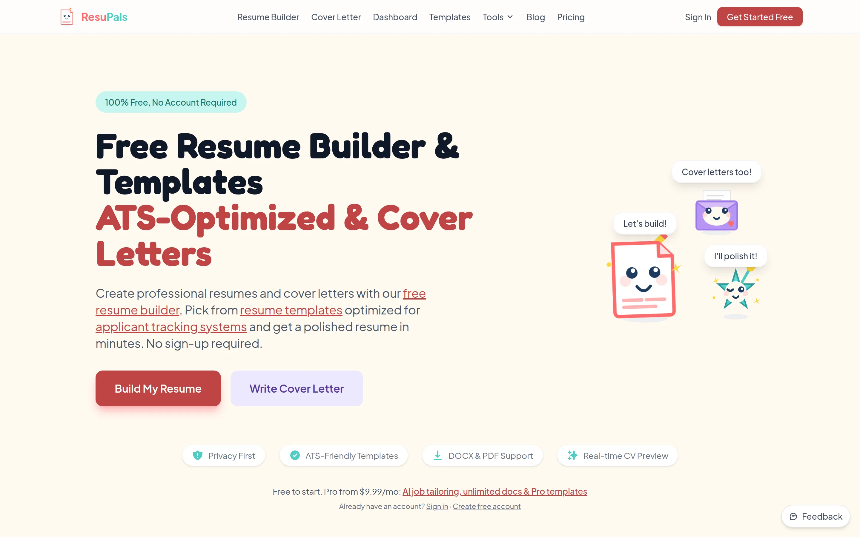
These are the same cards used on Work. A screenshot card and a text-only project keep their actual content and state.
Preview settings stay inside this specimen.
The title is the navigation target. Hover moves the whole card slightly; images stay opaque and keep their natural ratio. Pass the heading level that fits the surrounding page.
Galleries and honest fallbacks
Use real captures with intrinsic width, height, alt text and captions. An empty screenshot collection uses a project plate.
Screenshots
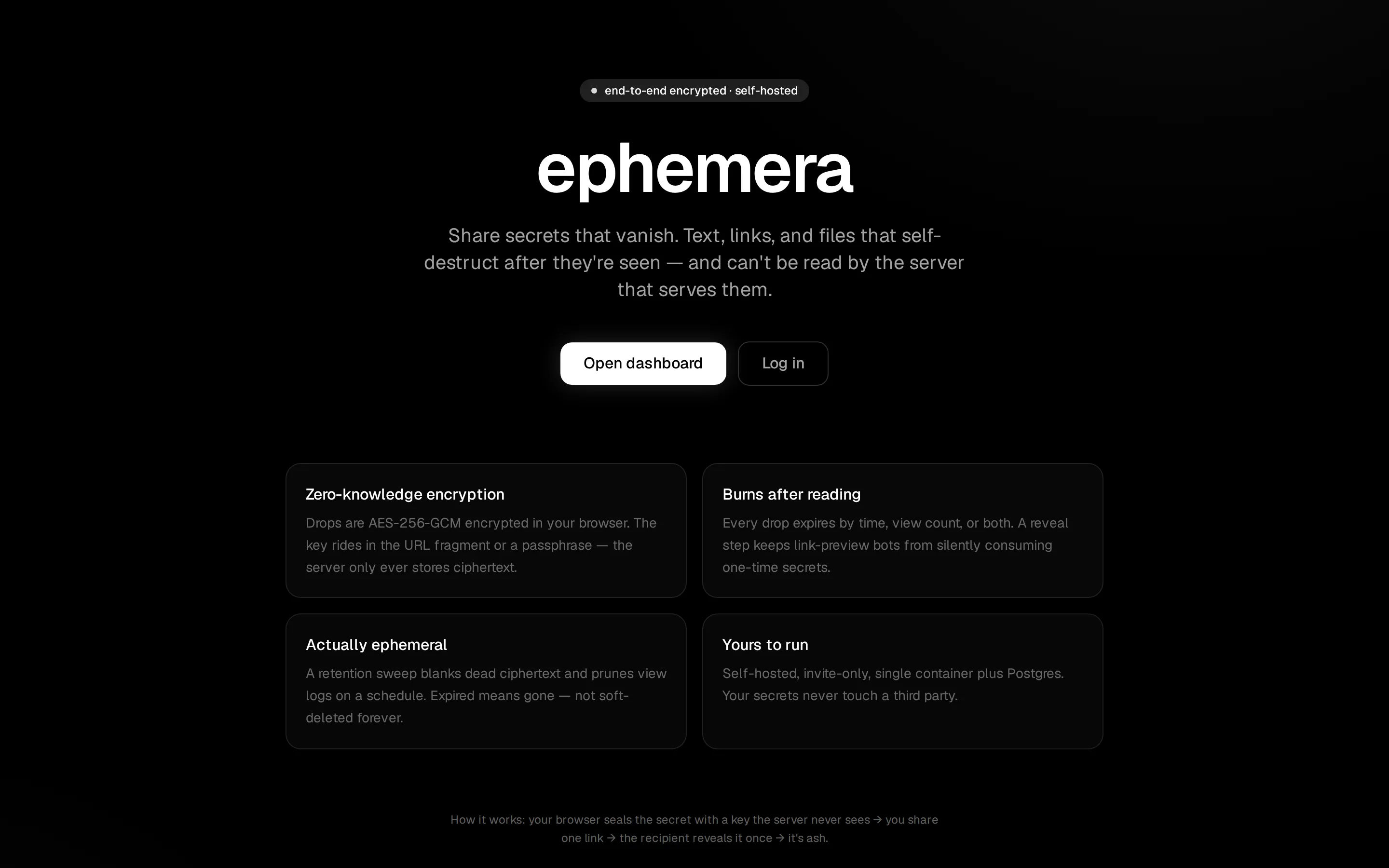
An overview of encryption, expiry, view limits, and self-hosting. 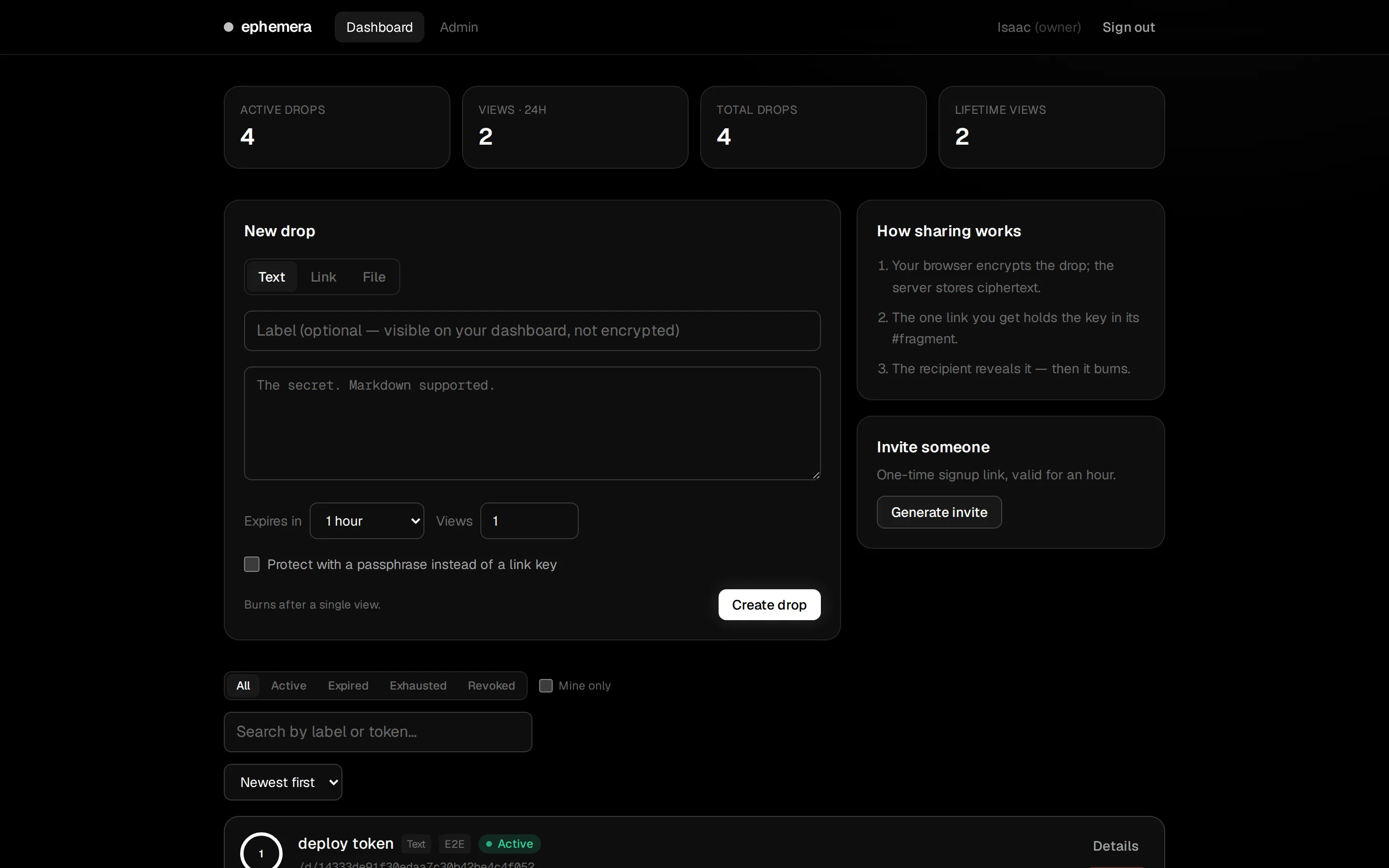
Expiry and view count are chosen before the browser encrypts anything. 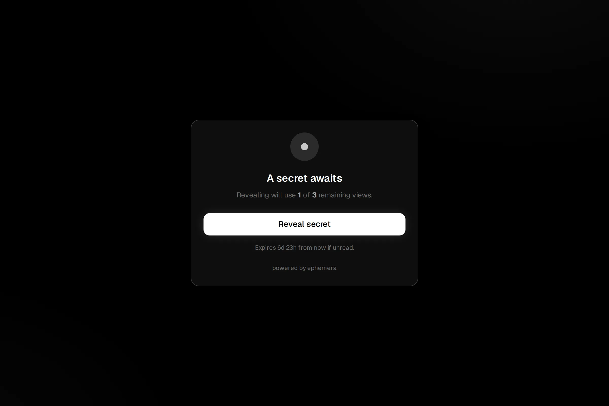
The reveal gate keeps link previews from consuming a view. 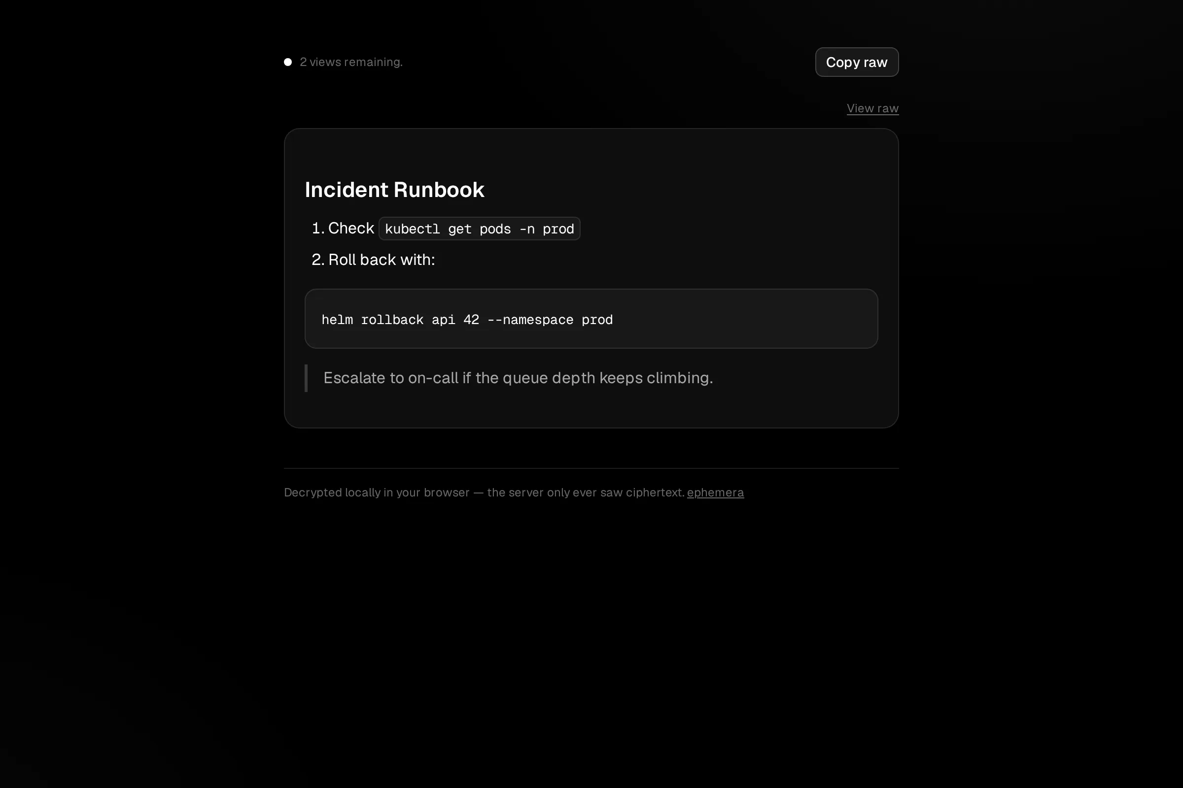
The recipient decrypts the secret locally before its Markdown is rendered.
notARobot has no graphical interface. Its fallback shows a real skill excerpt.
humanize-writing/SKILL.md
## Severity tiers

| Level      | Meaning                    |
| ---------- | -------------------------- |
| ban        | Reduce to zero.            |
| limit N/M  | At most N per M words.     |
| flag | Report it, leave it alone. |import { ProjectGallery } from '@/components/work/ProjectGallery'
import { ProjectPlate } from '@/components/work/ProjectPlate'
import { getProject } from '@/content/projects'
<ProjectGallery project={getProject('ephemera')!} />
<ProjectPlate project={getProject('notarobot')!} />Preview settings stay inside this specimen.
Work cards fill their media area edge to edge. Galleries show complete captures. The product stage adds perspective to one image plane with one border and a soft shadow. Keep padding, opacity fades and offset duplicate edges out of that frame.
Try the product stage and its geometry controlsThe chapter navigator
This is the actual homepage in a separate viewport. Scroll inside it or select a chapter to exercise the shared navigator.
The bar appears after the first scroll and stays attached to the bottom, including a return to Start. Its blue rule follows the current section. Native links preserve the URL fragment and Back history. On mobile it spans the viewport and includes safe-area spacing.
Tab follows chapter order and Enter activates a destination. Same-page links never start page-transition snapshots. The footer leaves room for the fixed bar.
Open the full-size homepageimport { ChapterNavigation } from '@/components/home/ChapterNavigation'
// Render once in Home, alongside its start, build, client, studio and talk sections.
<ChapterNavigation />Page compositions and recovery
- Home
- Hero pairs a centered introduction with the product stage. TwoTracks separates product work from website rebuilds. SelectedWork presents the Tyken comparison. AboutPreview joins studio copy with the orbit, and ContactCta closes with one inquiry link.
- Work and project detail
- Group products, work in development and client work using ProjectList. Detail pages pair the actual media with verified facts, a destination and a next-project link.
- About and Contact
- About combines the stationary mark and orbit with company context and disclosures. Contact offers the published email. A mail form appears only when delivery is configured; provider acceptance is never described as proof of inbox receipt.
- Missing pages and errors
- Unknown routes return 404 with useful links. Rendering errors offer a retry and a way back to the site. Keep recovery available without animations or external services.
Documentation components
DemoPanel supplies the Preview and Code tabs above. Arrow keys, Home and End select tabs. Each preview has its own theme. CodeExample and CopyButton provide copy confirmation and selectable fallback text if clipboard access fails.
ChapterHeader, Specimen and ChapterNext provide the structure of these pages. Every specimen has a direct fragment link. DesignNav marks the current chapter, and the overview catalog links the visible pattern to its source.
import { DemoPanel } from '@/components/design/DemoPanel'
import { Button } from '@/components/ui/Button'

<DemoPanel name="Disabled action" code={'<Button disabled>Unavailable</Button>'}>
  <Button disabled>Unavailable</Button>
</DemoPanel>